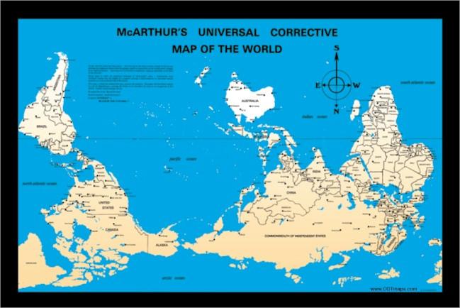
Maps are something that can be read in a variety of ways. They are used for not only directions but can be used by people to get different information. That can be average votes, different ethnicities or average income of certain places. Many maps have been created in a variety of ways. On maps there are different things included. Most commonly there are lines of longitude and latitude, a legend, a scale, and a title. All of these are key components to a map. The Peters Map put countries back to their equal proportions. This rectangular map made the area correct sizes relative to each other. Issues with this include the shape of the map and how it is stretched out. When looking at this map you see that certain places are the same size but are not in real life. In comparison when looking at the MacArthur’s map it places Australia at the top, this is a completely different view point compared to how we usually see maps. It is interesting to see the United States is above Canada which is not usually how we view the map. This map is highly recognized in Europe and is seen as a bias. They like to view it this way because they feel like being on top is superior. When looking at both of these maps you are able to see things from a different viewpoint. It allowed me to look at things in a different way and not just the basic maps that we are used to seeing everyday.
Map viewpoint